The Beginning
My initial task upon starting the project was to review all of The Skills Networks' user facing interfaces and content, identifying any obvious gaps.
Immediately two obvious problems stood out:
Very minimal responsive implementation for the site and learning app, meaning that users couldn't complete most signup processes or forms on anything other than desktop devices.
Zero consideration for any basic accessibility standards.
Based on these two findings I proceeded to facilitate user interviews to find out how clients used the website as well as access BI to pull data around typical devices and ways people accessed The Skills Network.
The results were shocking.
73% of users were trying to sign up and access via mobile despite the site not being compatible. Through the interviews it also became clear that most users really struggled with the length and complexity of the various forms they had to fill in to sign up for a course or get funding for one. Many would start on mobile and then switch to desktop to be able to complete the process. There were also a high number (≈30%) of users who struggled with accessibility, one of the main complaints being the lack of contrast due to how the brand colours had been utilised. Many also mentioned the unclear labelling and confusing use of industry language and acronyms.
A tale of two concurrent projects
With the initial findings in place a plan was hatched - the goals were to make everything clear, simple, accessible and inclusive.
On the UX side this would include a new responsive UI, an optimisation of signup processes and forms, simplification of the sitemap, and a rewrite of all copy. I led the creation of a component based design system using an atomic approach to enable quicker and easier prototyping and to help enable reactive improvements and refinements in future. I created both high and low level design concepts for mobile and desktop. I worked with internal copywriters to ensure all text was as simple and inclusive as possible.
For the rebrand, I was constrained by the business wanting to improve and build on what they already had rather than a blank canvas redesign. I created a similar but more accessible version of the existing brand colour palette along with introducing more accessible fonts. Guidelines on inclusivity for both text and imagery were included in the new brand book. I tasked the graphic designers on my team with creating a bespoke in-house library of inclusive and playful illustrations to replace generic stock photography that the brand had relied on previously. The brand logo was updated and simplified, enabling the symbol to still be legible when used at smaller sizes.
Mobile concepts
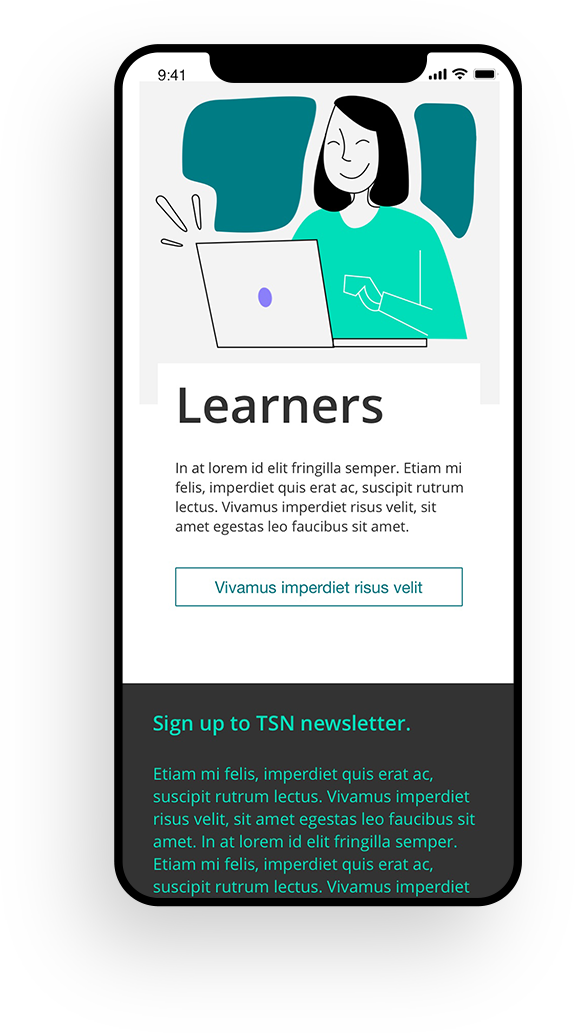
Mobile concepts
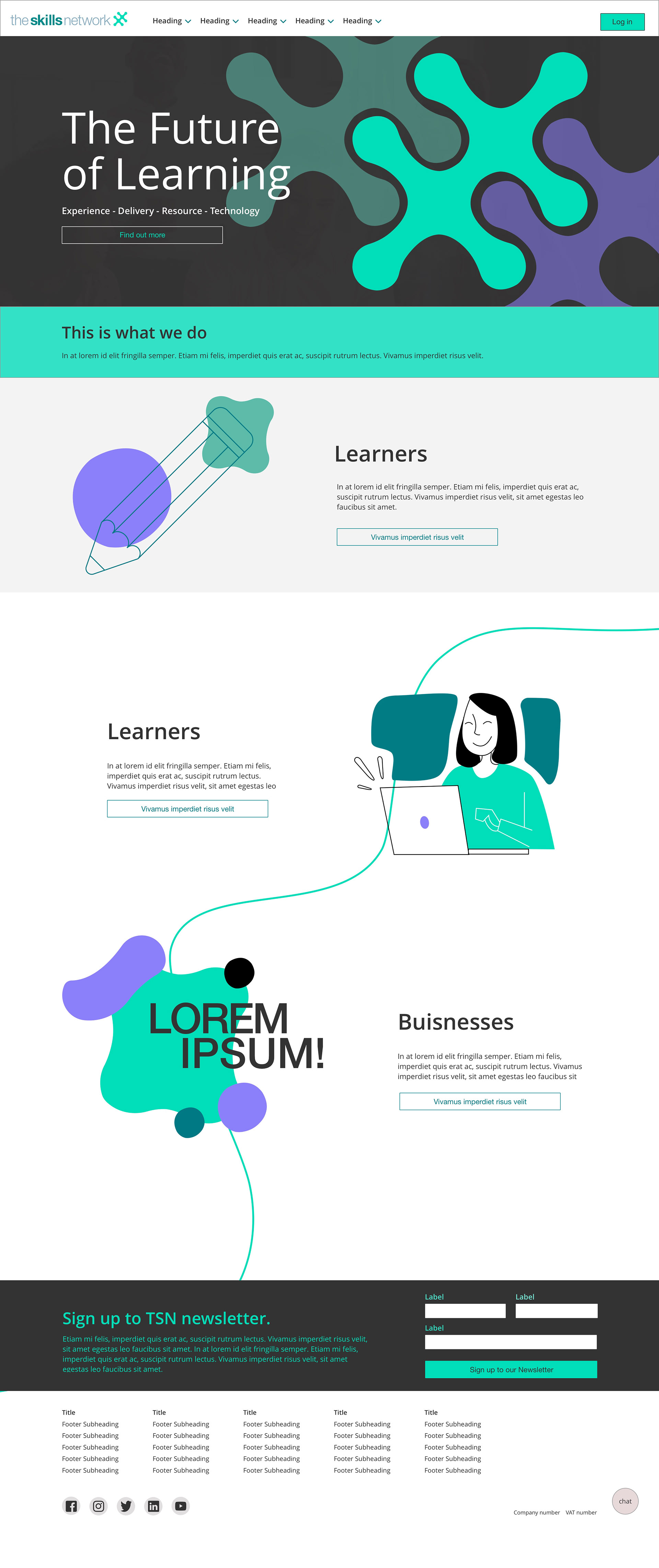
Desktop concepts
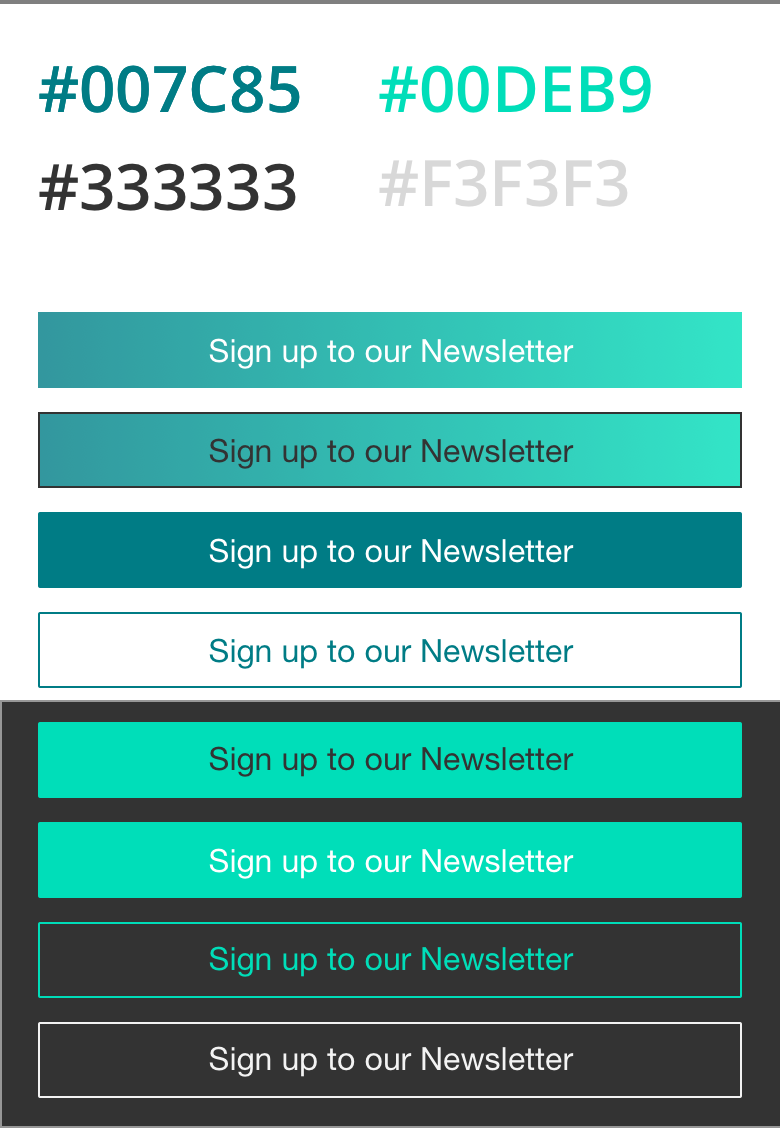
Accessible buttons styles
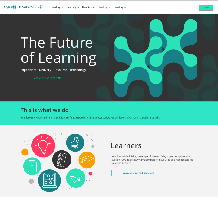
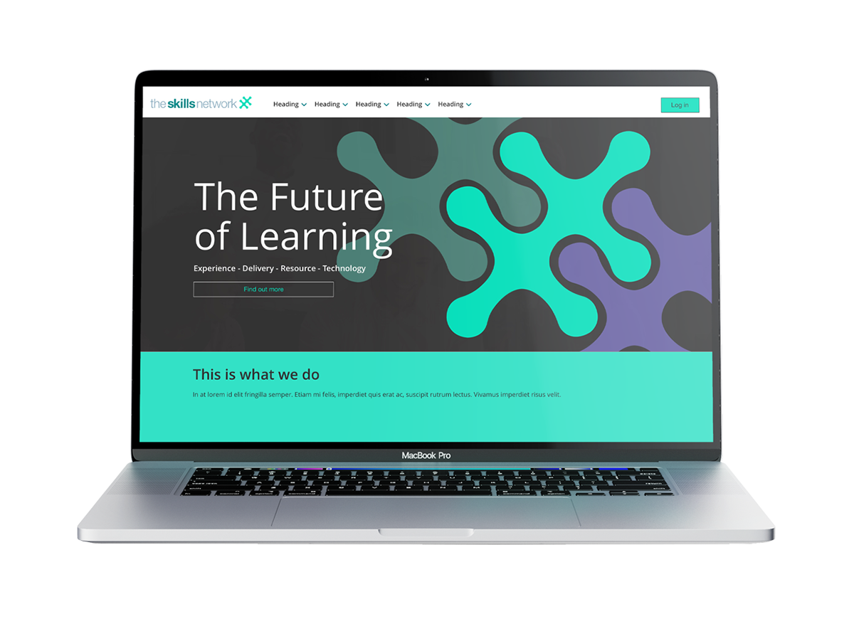
Revamped homepage
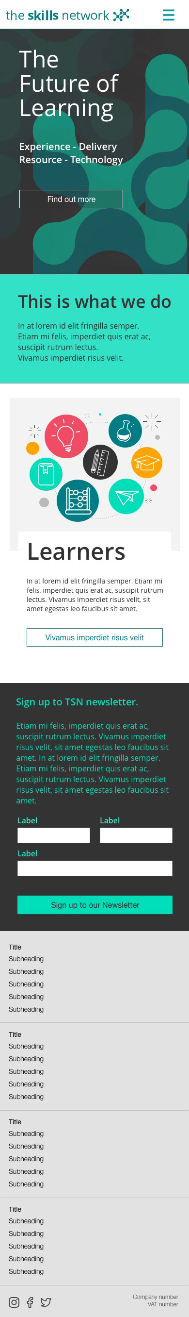
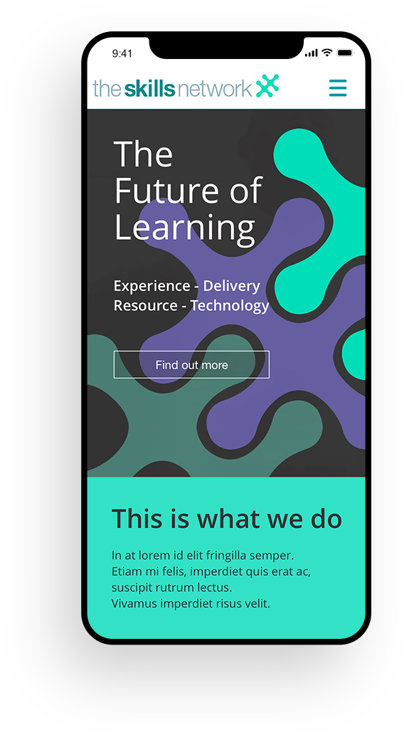
Revamped homepage (mobile)
Early ultra high level wireframe
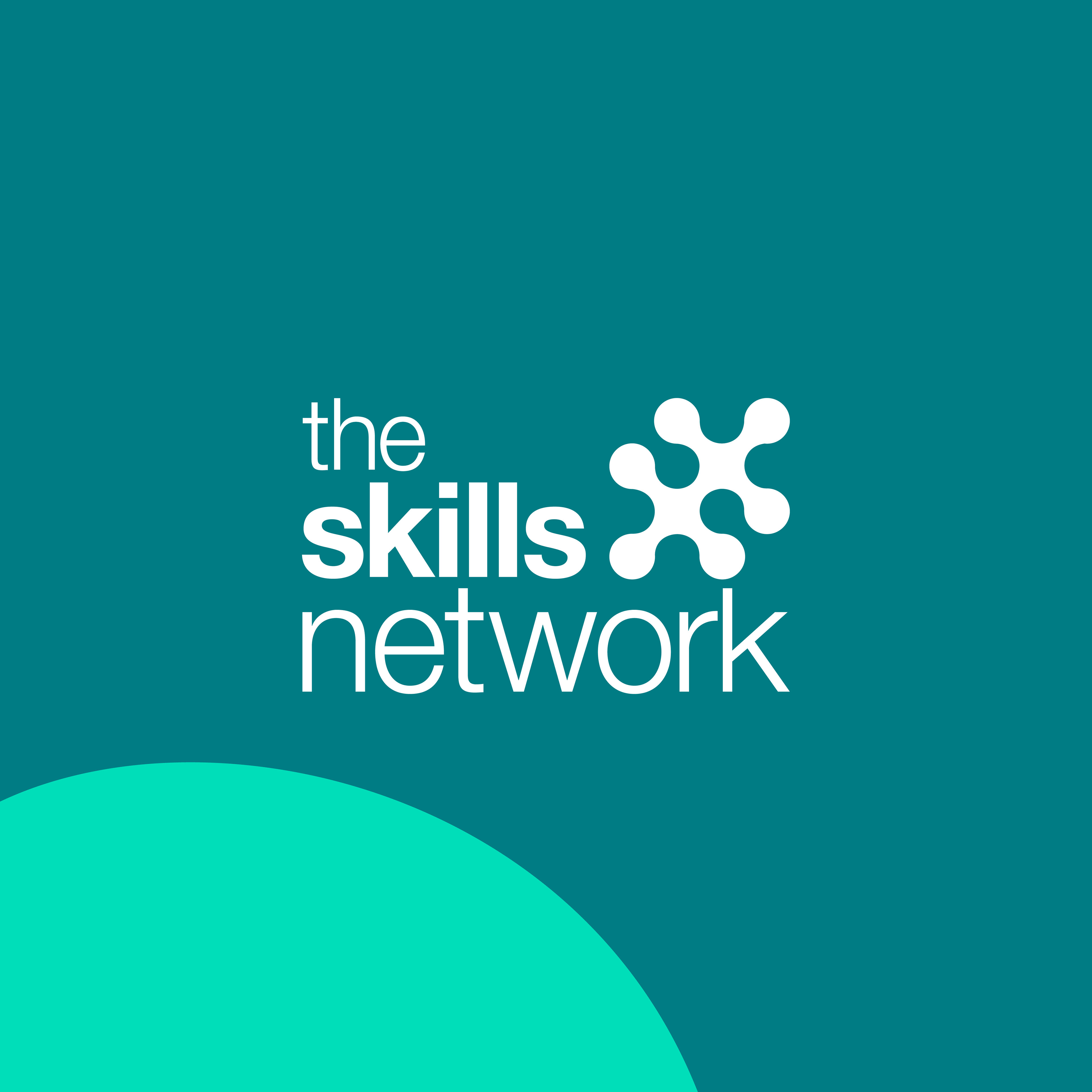
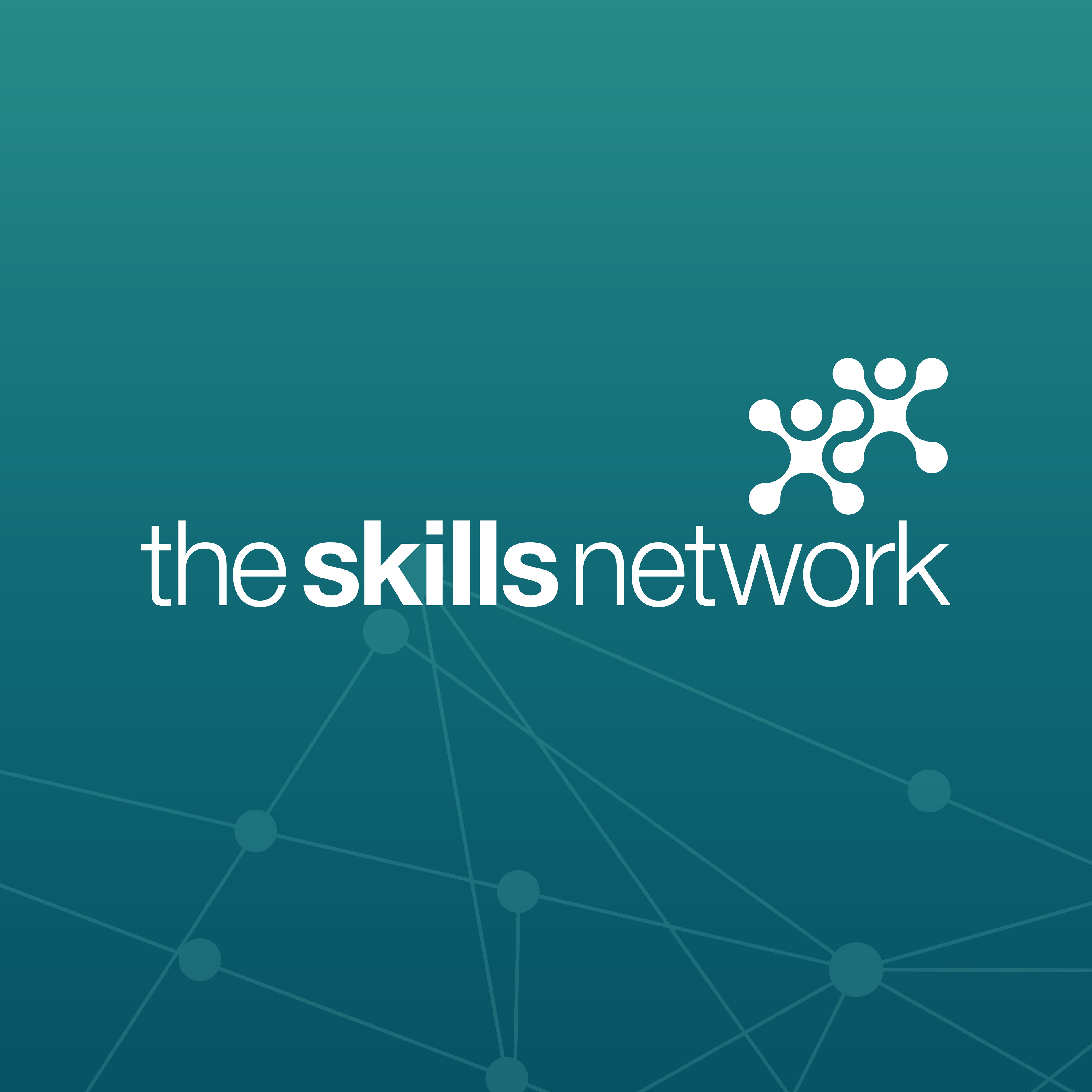
New brand logo
Old brand logo
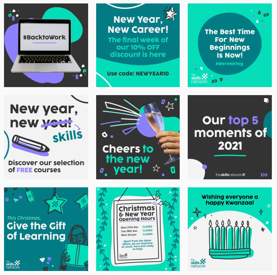
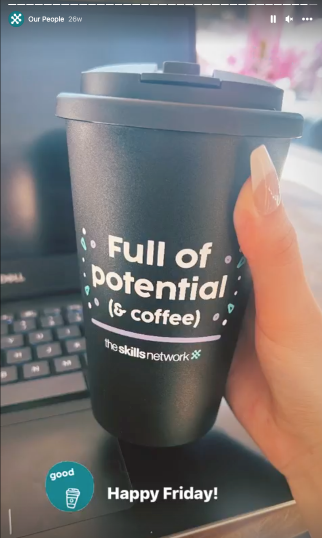
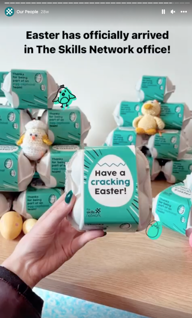
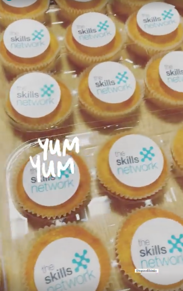
New branding social media posts
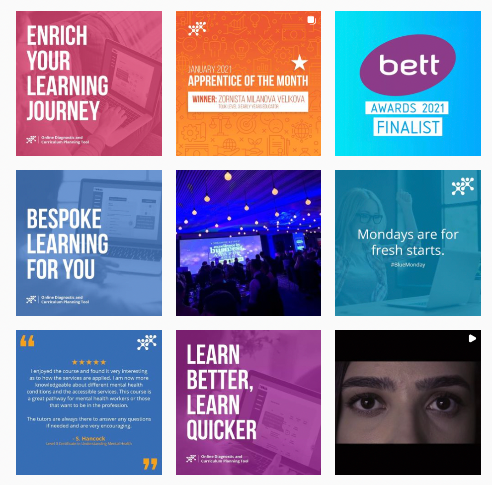
Old branding social media pposts
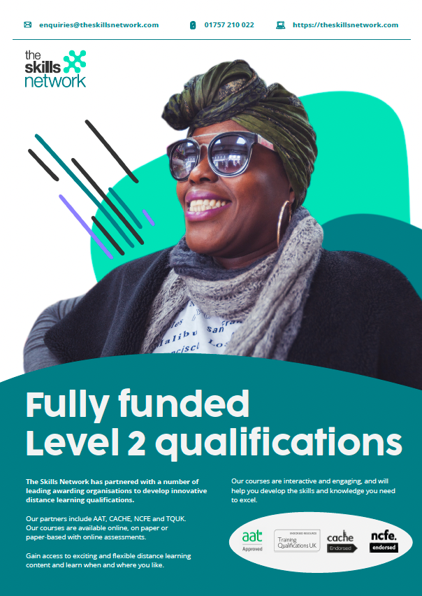
New branding print design
The 'doing'
To be successful in the project, we needed to achieve the following:
A clear, easy to use, website that could be accessed from any device by anyone wanting to sign up for a course.
Simple, accessible, inclusive and clear new branding.
UX overhaul
For the UX overhaul we started by going through the sitemap and reducing it as much as possible, rearranging the hierarchy to be logical and easy to navigate (see before/after maps in presentation above). We then moved on to refining all forms and signup processes. We achieved this by liaising with SME's and stakeholders within the business to reduce and reorder content, optimising any user form as much as possible. We created a new, more concise 'happy path' for signup that had clear signposts and help text to help users get through the process. We A/B tested it against the existing journey, finding that it performed almost 100% better immediately. After implementing the new signup journey we further refined it, testing against the previous version each time until we had a signup process that performed 5x better than the original when combined with the new cross device compatible UI and simplified site map. Once this was in place, we utilised the marketing copywriters to optimise all site copy and rewrite it in an accessible way, while also introducing must have basic best practises such as alt text on all imagery.
Rebrand
For the rebrand, after carrying out an extensive competitor analysis, we surveyed stakeholders within the business and worked with the marketing team to create a 100 page brand manifesto. In it we detailed everything that The Skills Network stood for and how to apply it to every user facing output coming out of the business. We championed diversity, inclusion and accessibility. These were areas I felt were key to any education company and something that was reflected in our findings from user data and interviews too. I was responsible for moulding the creative direction of the entire rebrand, from picking the colour palette and fonts to defining the illustration style, how we used photography and the tone of voice.
The Conclusion
This project was one of the most of extensive and rewarding of my career so far. Utilising my hand recruited team of talented designers I was able to totally reshape a brand and all of its customer touch points across all mediums. Our work transformed every area of the business - both physical and digital - we even redecorated the offices.
The power of applying UX thinking and processes to an entire brand resulted in a corporate identity and experience that was not only totally cohesive and consistent, but one that was fun, approachable, accessible and inclusive.
Customer feedback both via user surveys/research and from social media was overwhelmingly positive. The numbers spoke for themselves too. We saw signup on certain courses go from <200 per week to in some cases almost 1000. Bounce rates on sign up forms dropped exponentially. Customer complaints dropped by almost 50%. The website went from page 6 of google to the top 5 results in the relevant key word areas.