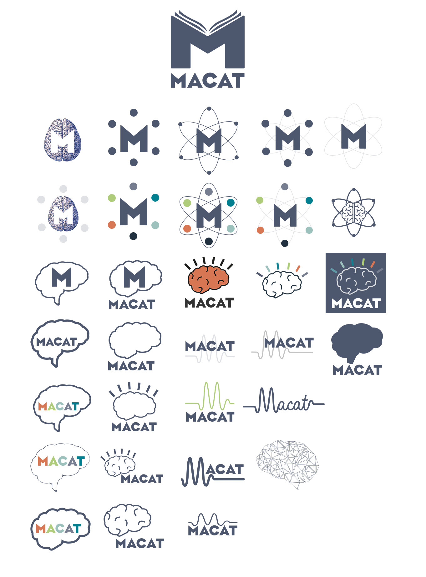
The brief was to create a logo which invokes 'smarter thinking' and that would be instantly recognisable across a range of media formats and include absolutely no lightbulbs!
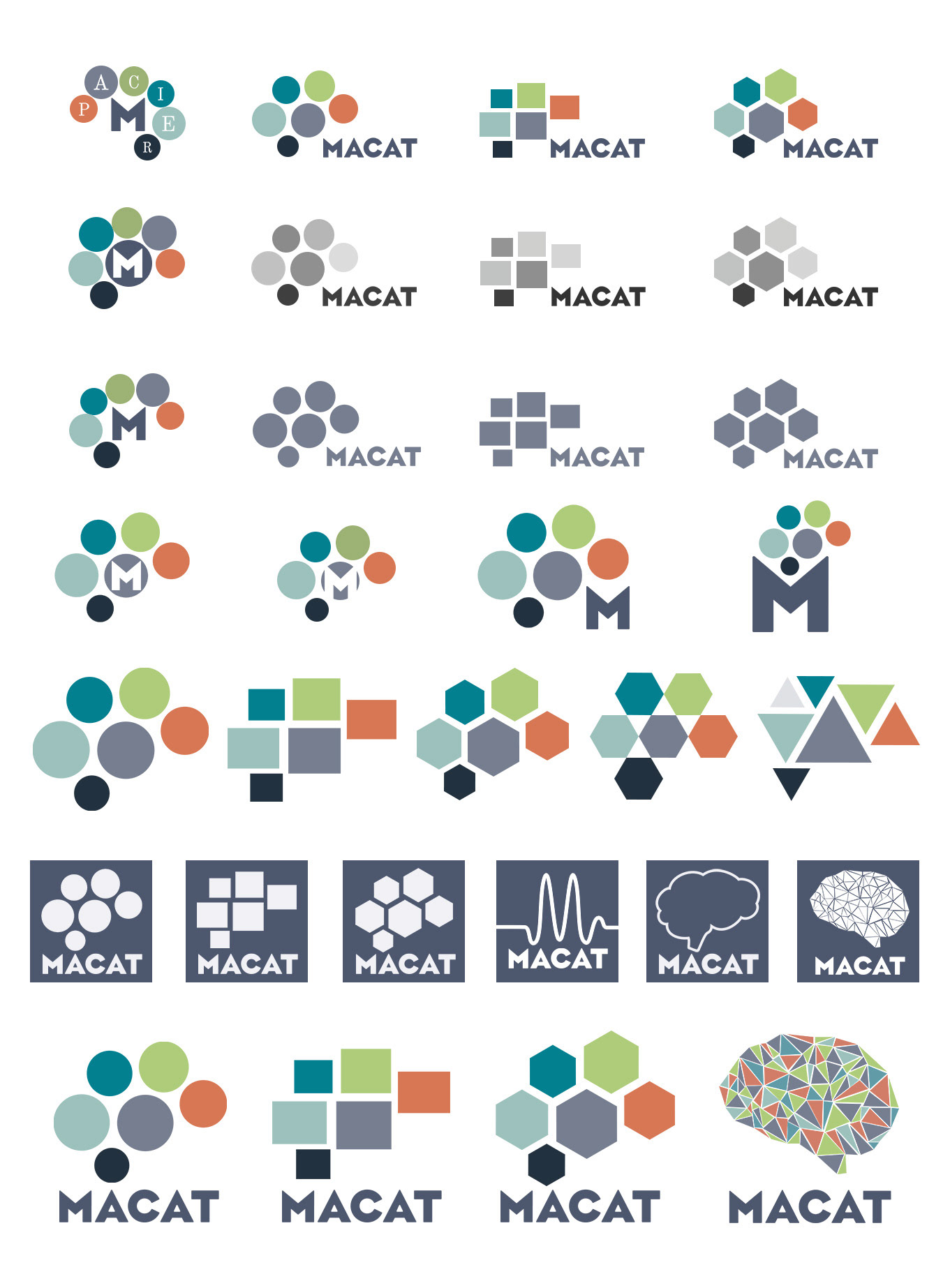
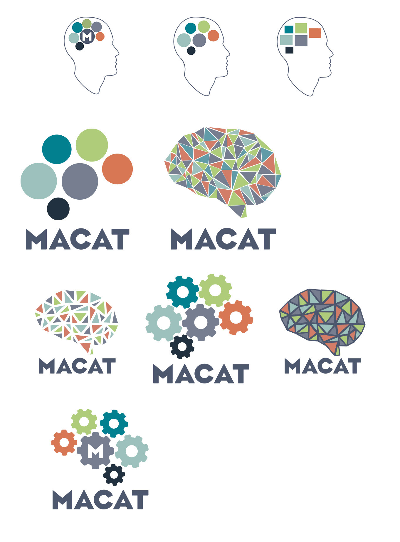
The ideas were narrowed down to the two logos here.


The polygon style logo signifies the critical and statistical approach the company uses to teach more efficient decision making skills and also represents a mosaic of ideas that make up the Macat learning system.
The dot based logo evokes the six elements of the companies PACIER learning system and also the various lobes of the Brain.
Below are also contact sheets of some earlier ideas.